
Sectors News Mentions
The News Mentions feature tracks and analyzes how frequently different tokens within a sector appear in news articles. This data helps identify trending projects, market sentiment patterns, and potential emerging narratives within...
 Written by taika · Creator of Token Radar
 Sectors News Mentions
The News Mentions feature tracks and analyzes how frequently different tokens within a sector appear in news articles. This data helps identify trending projects, market sentiment patterns, and potential emerging narratives within specific market sectors.
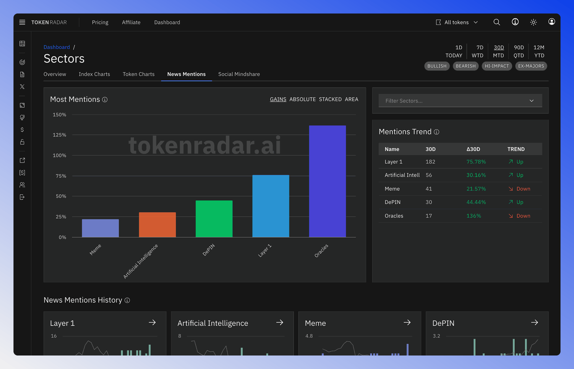
Time Range and Filter Settings
Located in the top right corner, these controls allow you to customize the data view:
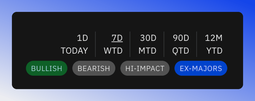
The filter options include:
- BULLISH: Display only positive sentiment news
- BEARISH: Display only negative sentiment news
- HI-IMPACT: Show news with significant market impact
- EX-MAJORS: Filter out major cryptocurrencies to focus on emerging tokens
Most Mentions Chart
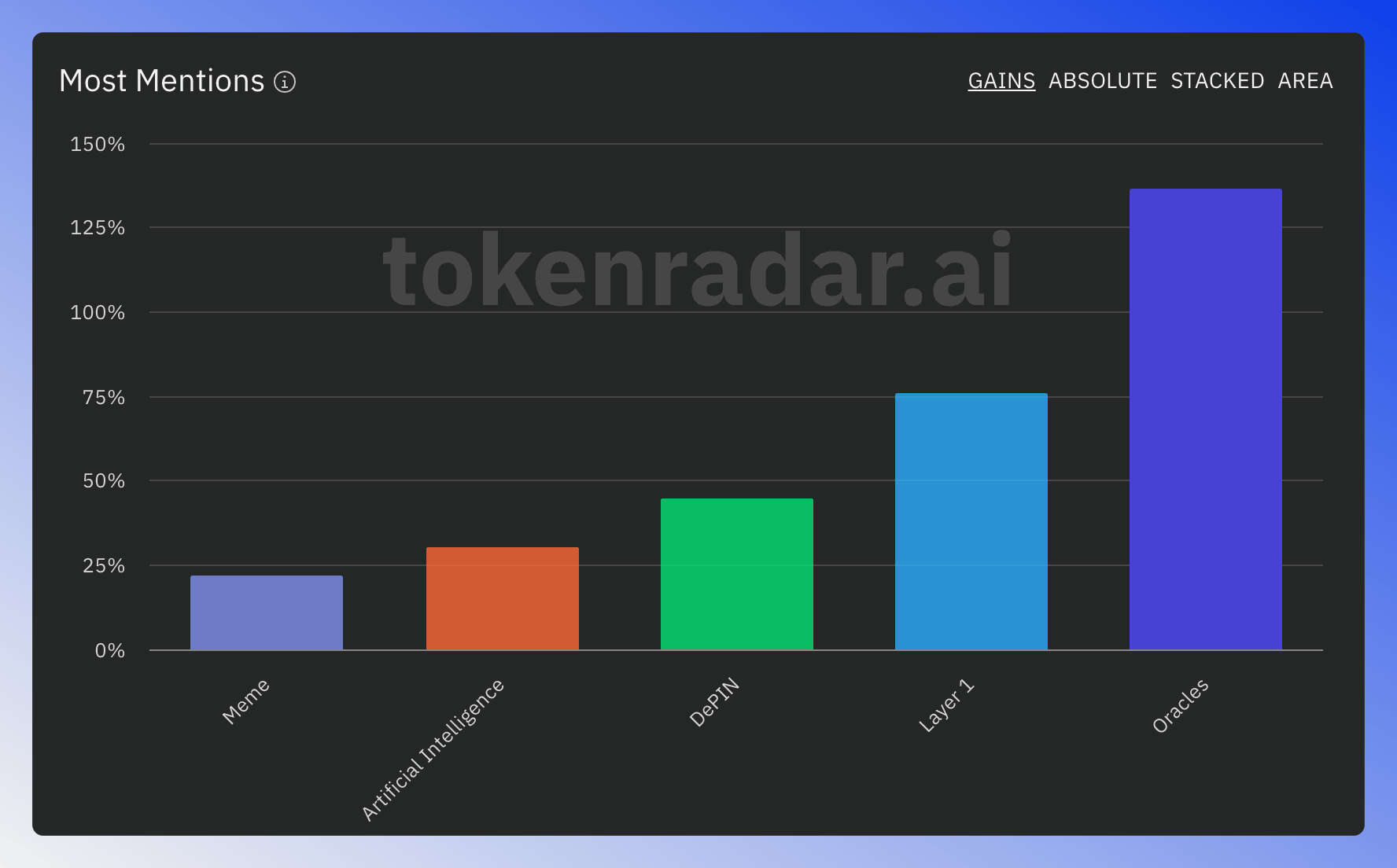
The Most Mentions visualization offers different views to analyze token mentions across news articles. Each token is represented by a distinct color for easy tracking across time periods.
For an in-depth description of the different chart types check out the corresponding section in the News Mentions feature. Use GAINS, ABSOLUTE, STACKED and AREA at the top of the chart to switch views. GAINS, the default, ranks by the percentage change of the 50-day average mentions. The Mentions Trend table next to the chart lists the values for the selected time period, their change and the trend direction.
Sector Mentions History Charts
The charts display news mention frequency over time for each sector:
- Green bars indicate positive long-term mention trends
- Gray line represents the sector's price index for correlation analysis
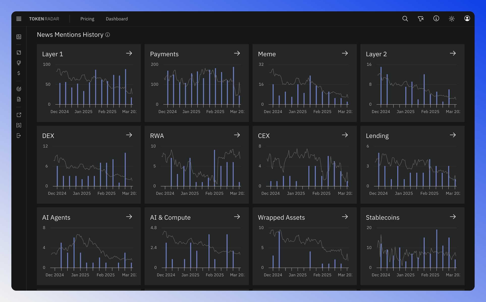
The charts display news mention frequency over time for each sector.