Sector Details Overview
The Sector page shows you which tokens and blockchains in that sector of the market are doing the best.
 Written by taika · Creator of Token Radar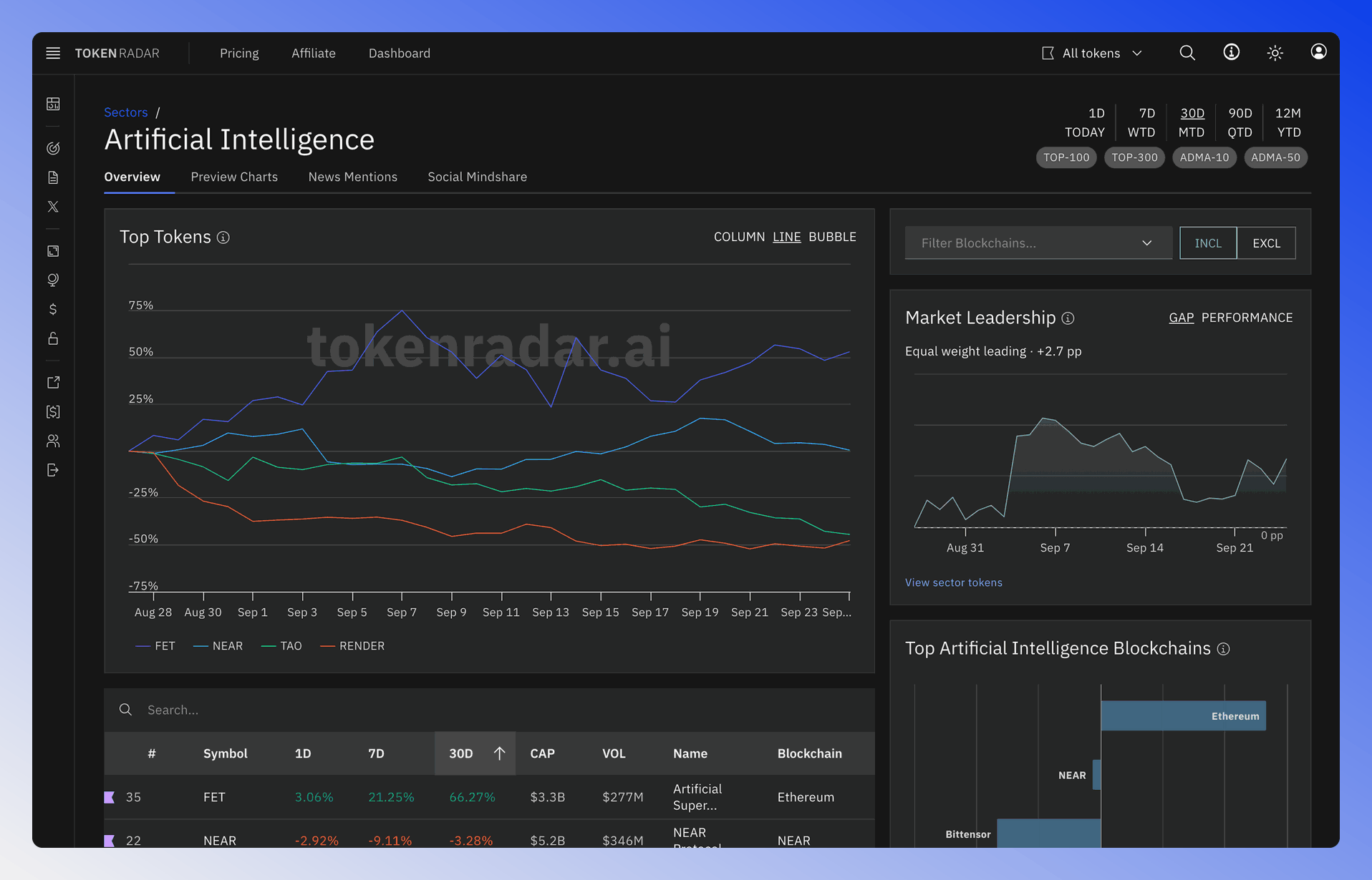
Time Range and Token Filter
You can adjust the time range and filter settings of the token chart and table using the settings at the top of the page.
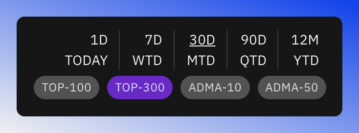
The available filter settings are:
- TOP-100: Show only tokens with Marketcap Rank < 100
- TOP-300: Show only tokens with Marketcap Rank < 300
- ADMA-10: Show only tokens trading above their Simple Moving Average 10
- ADMA-50: Show only tokens trading above their Simple Moving Average 50
Sector Filter
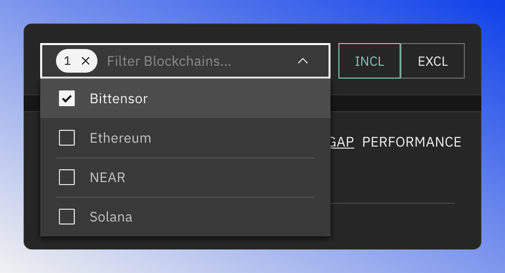
You can use the blockchain filter to show only tokens that belong to a specific blockchain. Or when selecting the exclude option, to exclude tokens that belong to a specific blockchain.
Top Token Charts
The Token Chart displays top-performing assets of the chosen sector.
The chart has three display modes:
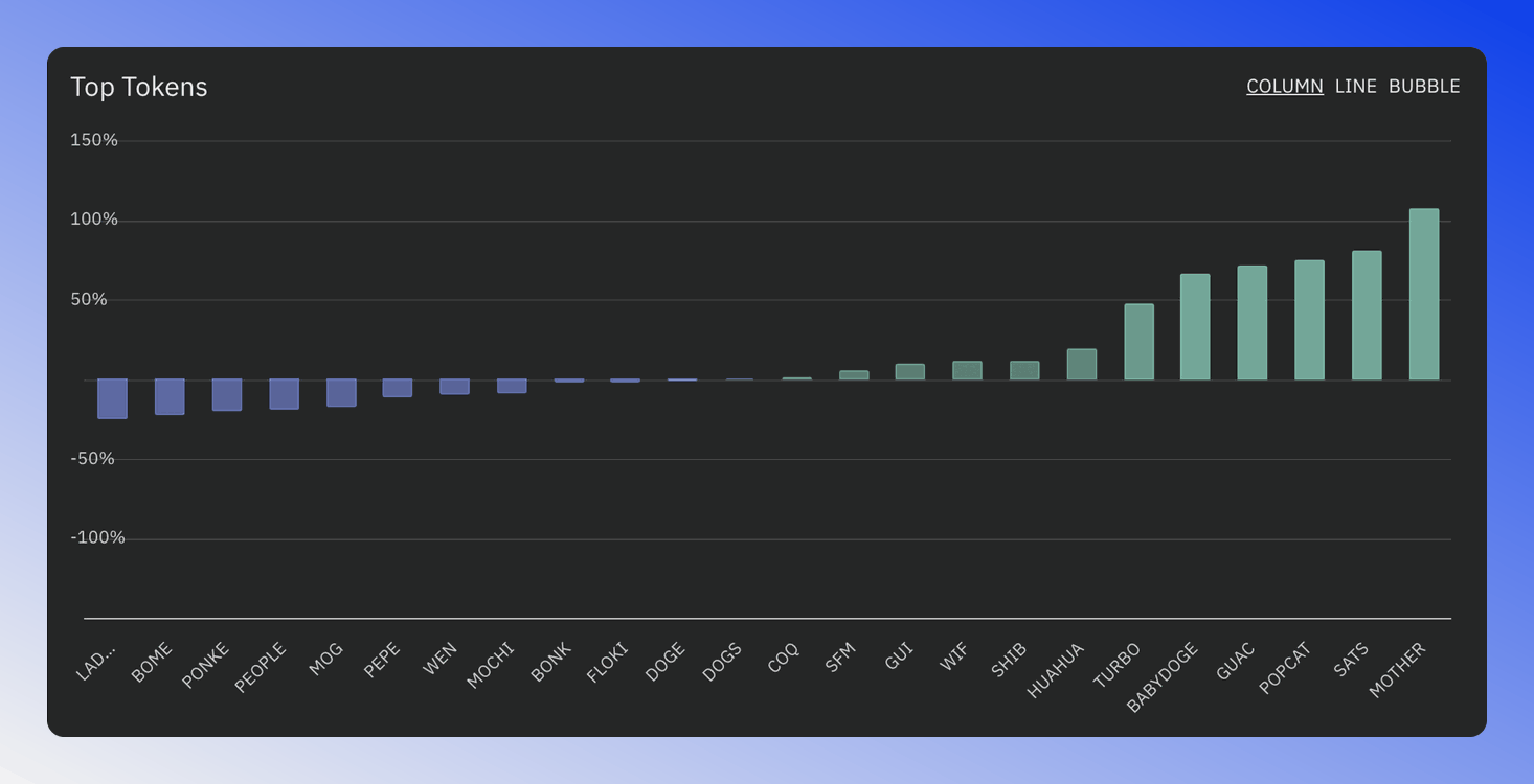
- Column: A simple column bar chart showing the top tokens.
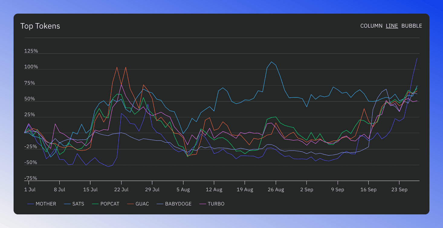
- Line: Shows the performance over time of the top 6 tokens of this sector.
- Bubble: A compact format with detailed information on the top tokens.
All modes adjust based on your chosen time range, token, and sector filter settings.
Column Chart
The Column Chart shows different tokens ordered from left to right based on how their price changed.
Tokens that had a price increase have green columns that go up. Tokens with a decrease in price have blue columns that go down.
Line Chart
The Line Chart displays how the top six assets have performed over a period of time. Each asset is represented by a different line on the chart.
To view more information about a specific asset, click directly on its corresponding line in the chart.
Bubble Chart
The Bubble Chart displays tokens based on price changes over recent periods:
- X-Axis: Price change (%) over the last 90 days on default time settings.
- Y-Axis: Price Change (%) over the last 30 days on default time settings.
- Bubble Size: Trading volume change over the last 30 days on default time settings.
- Bubble Color: Green, when the token trades above its Simple Moving Average 10 and 50, a bullish signal. Otherwise, Blue.
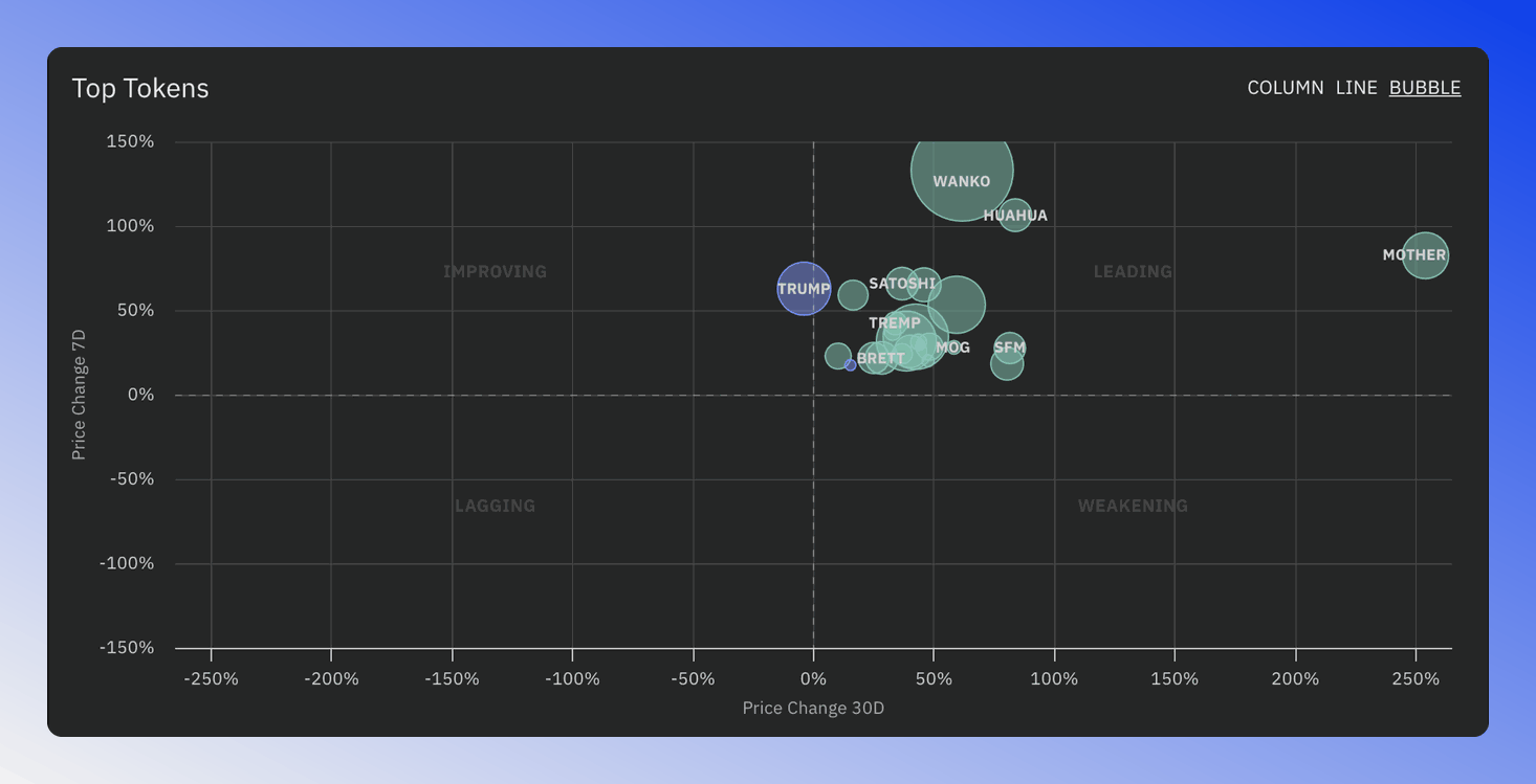
Bubble chart showing tokens based on price and volume changes with SMA status color coding
Tokens in the Leading quadrant of the bubble chart are currently performing well over multiple time frames. Keep an eye on tokens that do this, as those are also likely to perform well in the future.
Token Table
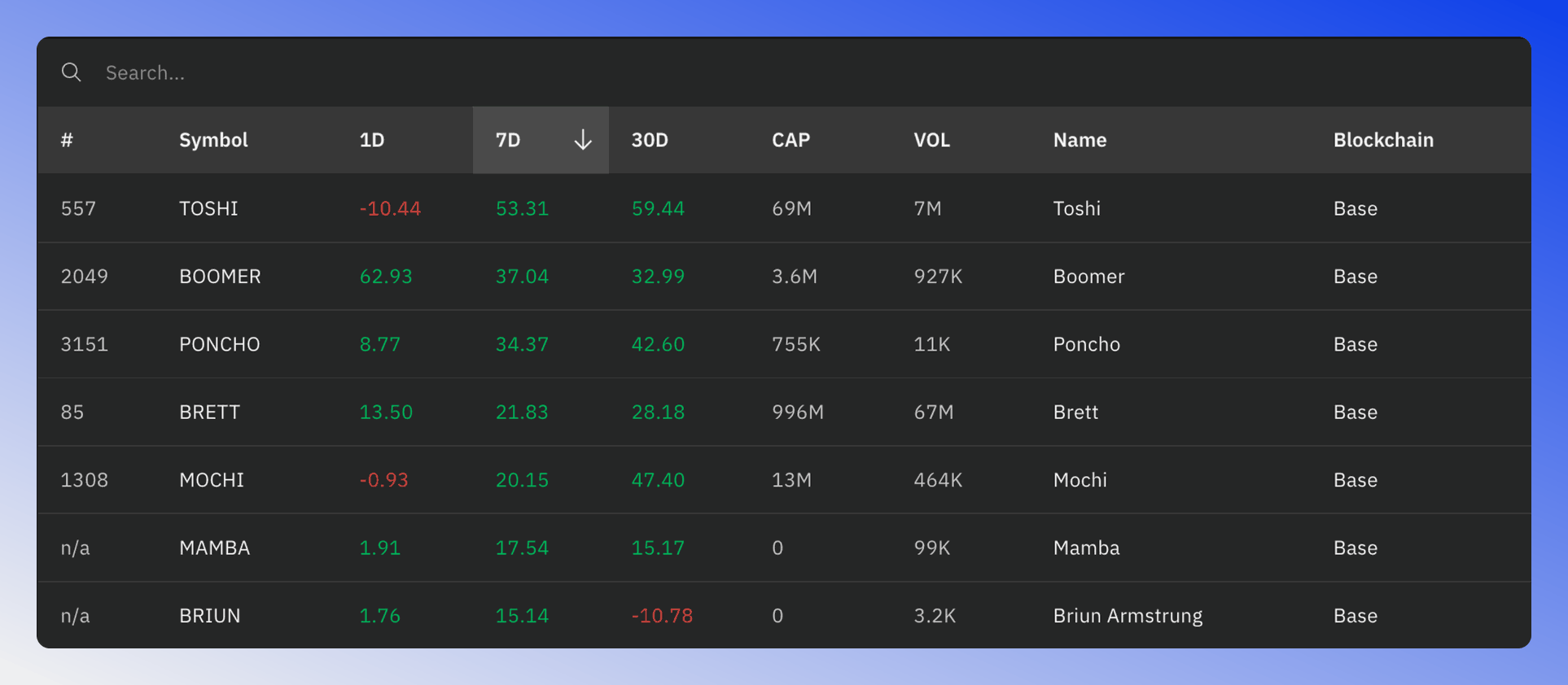
The Token Table provides essential information about the sector's tokens. The columns displayed depend on the selected time range, and the content adjusts based on your filter settings.
Market Leadership Chart
The Market Leadership chart compares an equal-weighted and a cap-weighted (marketcap-weighted) version of the index of this sector. An equal-weighted index gives more importance to smaller, lesser-known tokens compared to the cap-weighted one.
In a bull market, smaller tokens tend to outperform larger ones, so the equal-weighted index should trade above the cap-weighted one. The chart turns green when this is the case, and the line above the chart says which version is leading and by how much.
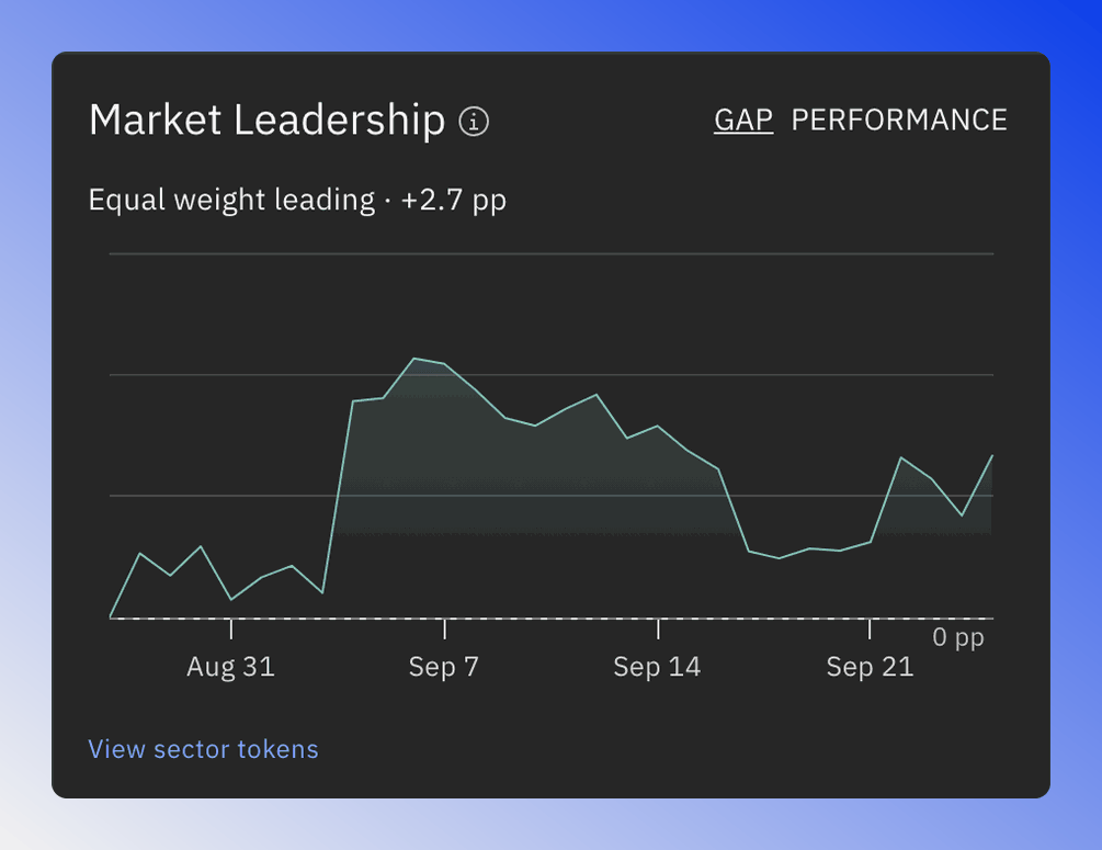
The Market Leadership chart has two modes:
- GAP: Shows the difference between the equal-weighted and the cap-weighted index in percentage points.
- PERFORMANCE: Shows both versions, starting at 100 on the first day of the selected time range.
In GAP mode, an upward-sloping line suggests a possible bullish trend reversal of this sector, while a downward-sloping line indicates a potential bearish reversal. The View sector tokens link opens the screener filtered to this sector.
Top Blockchains
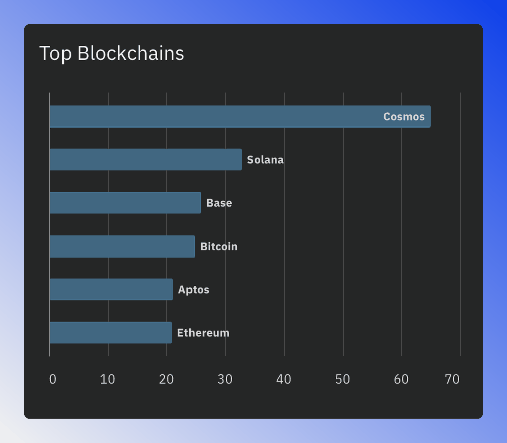
Use the top blockchains chart to identify the best-performing blockchains in that sector. Click on a column to filter the token chart and table by the selected blockchain.
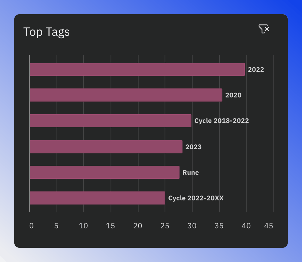
Top Tags
The Top Tags chart displays tags with the best current price performance in this sector. Click on a column to filter by that tag. To remove the filter, use the clear filter icon.