
Spaghetti Chart
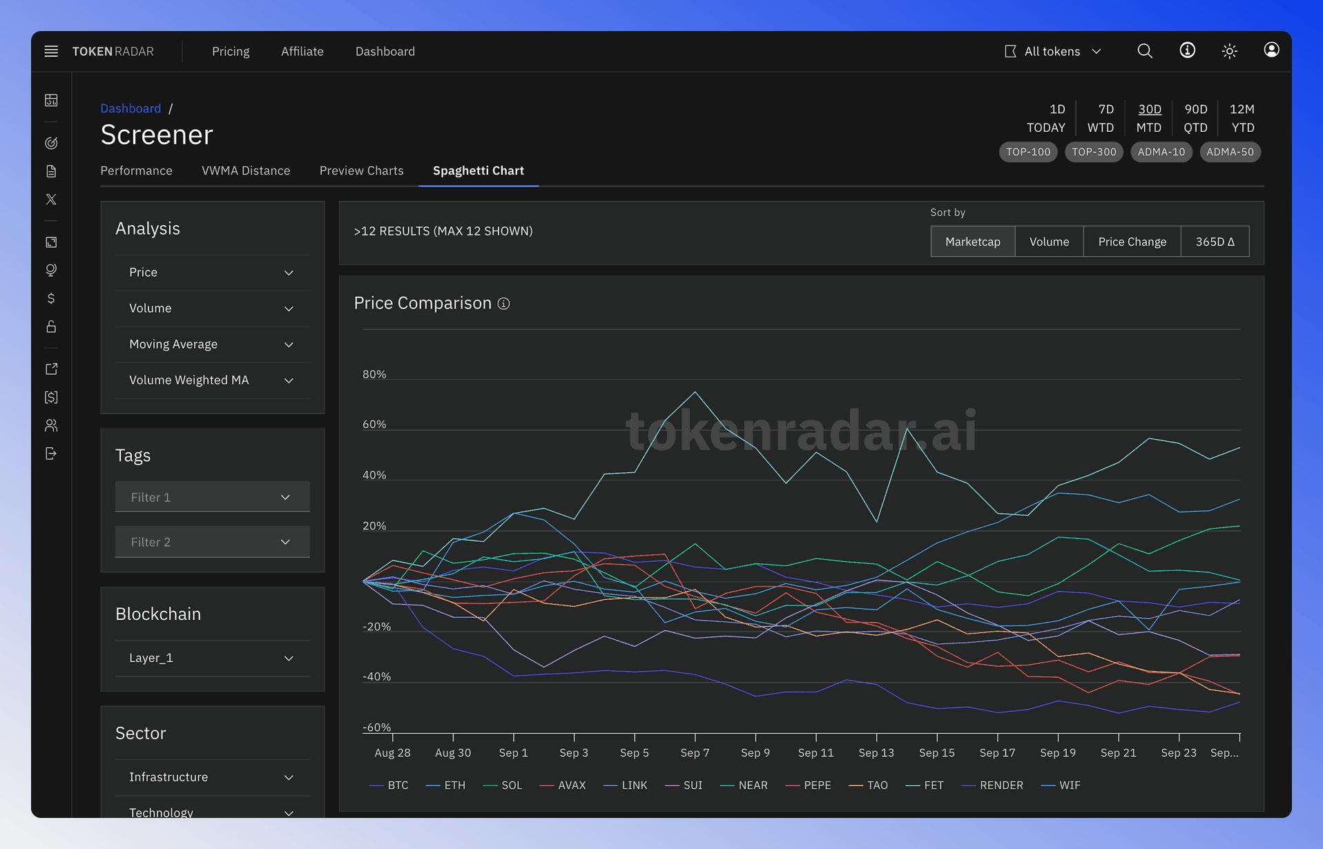
The spaghetti chart is a powerful visualization tool that allows you to compare the price performance of multiple tokens over time in a single chart. This makes it easy to identify which tokens are outperforming or underperforming...
 Written by taika · Creator of Token Radar
 Spaghetti Chart Screener
The spaghetti chart is a powerful visualization tool that allows you to compare the price performance of multiple tokens over time in a single chart.
This makes it easy to identify which tokens are outperforming or underperforming relative to others in your selected group.
Features
- Compare up to 12 tokens in a single chart view, or up to 24 when a favorites list is selected
- Choose which tokens are compared with the Sort by options (Marketcap, Volume, Price Change or 365D Δ) and the filter sidebar
- Normalize prices to a common starting point for fair comparison
- Interactive legend to toggle individual tokens
- Time range selection for different comparison periods
- Hover tooltips showing exact values at any point