Blockchains Overview
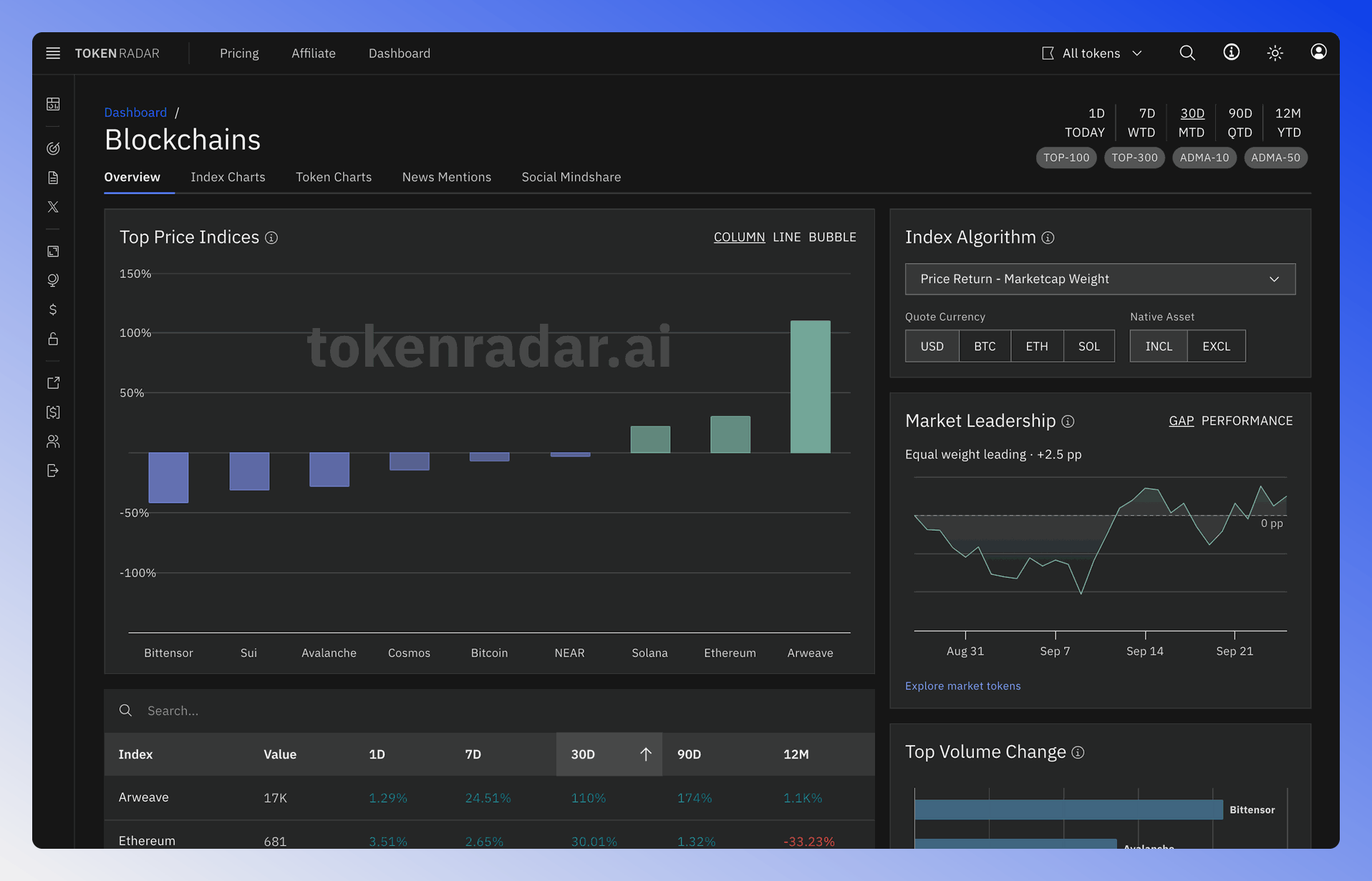
The Blockchains Overview page offers a quick snapshot of how different blockchains are performing.
 Written by taika · Creator of Token Radar
 To make this easier, we've created an index for each blockchain. An index combines multiple data points into a single number. In our case, it measures how well all tokens of a specific blockchain are performing together.
Instead of looking at many separate tokens, you can use these indexes to get a clear picture of each blockchain's overall performance.
Algorithm Selection
The options in the Index Algorithm tile next to the chart let you change how the calculation of the indices works:
- Algorithm: Select different calculation methods for the indices.
- Native Asset: INCL includes and EXCL excludes the native token, like BTC or ETH, from the index calculation.
- Quote Currency: Compare price and market cap changes to a different asset such as BTC or ETH. For example, set the quote currency to BTC to see which blockchain indices outperform holding bitcoin.
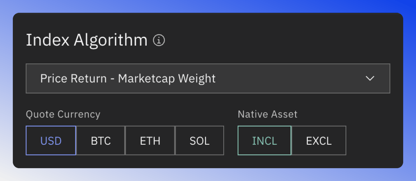
Algorithm selection interface for calculating blockchain performance indices
Depending on your preferences, you can choose between the following algorithms:
- Marketcap - Standard Weight: Use when you want larger-cap tokens to have more influence on the index.
- Marketcap - Equal Weight: Choose for a more balanced representation of all tokens, regardless of market cap.
- Price Return - Marketcap Weight: Opt for this when you want to focus on price changes, with larger-cap tokens having more impact. Highly responsive to price movements, especially of higher market cap tokens.
- Price Return - Equal Weight: Select when you want to emphasize price changes equally across all tokens. Most responsive to price movements across all tokens in the index.
The default setting is Price Return - Marketcap Weight, which means the index tracks the price performance of tokens weighted by their market capitalization. This provides a balanced view of the ecosystem's overall performance. But if you want to be ahead of the curve, you might prefer Price Return - Equal Weight. This option will respond more quickly to market shifts.
Time Range Selection
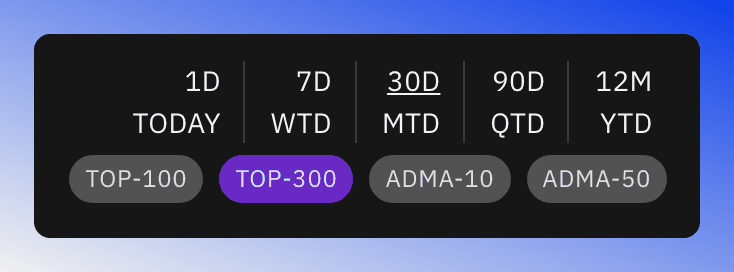
You can adjust the time range of the charts using the time settings at the top of the page.
The filter section has no effect on this page.
Indices Charts
The Top Price Indices chart (Top Marketcap Indices when a marketcap algorithm is selected) has three display modes. Use COLUMN, LINE and BUBBLE at the top of the chart to switch between them.
Bubble Chart
The bubble chart shows different blockchain indexes. It compares how their market value or price has changed over time.
- X-Axis: Marketcap or Price Change over the last 90 days on default time settings.
- Y-Axis: Marketcap or Price Change over the last 30 days on default time settings.
- Bubble Size: The size of the bubble indicates the volume change of the index.
- Bubble Color: Green, when the index trades above its Simple Moving Average 10 and 50, a bullish signal. Otherwise, Blue.
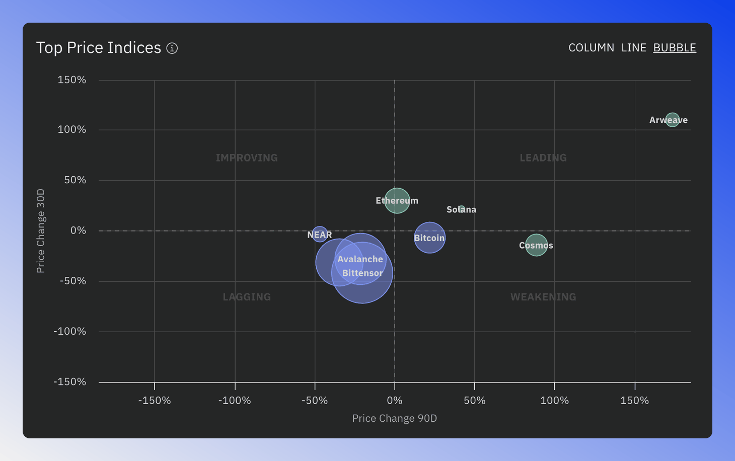
Bubble chart showing blockchain indices based on market cap and price changes
Blockchains are grouped into quadrants such as "Improving", "Leading", "Weakening" and "Lagging" based on their performance. For potential future outperformers, focus on the "Leading" and "Improving" quadrant, as it highlights blockchains showing positive momentum and growth.
Line Chart
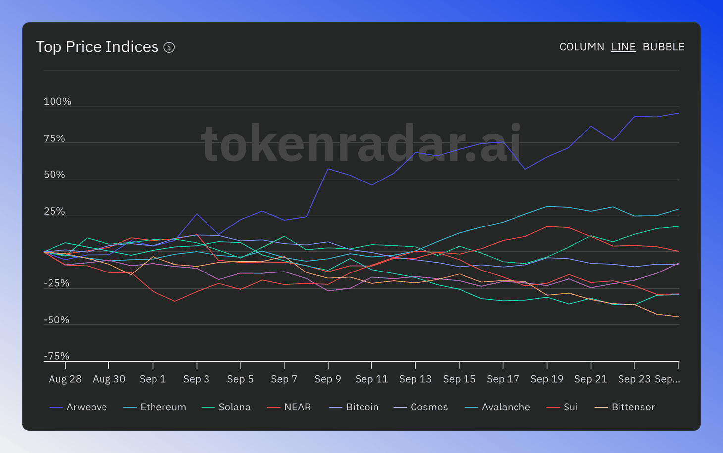
The Line Chart displays the relative historical performance of the top six blockchains over time.
Click on any line in the chart to view detailed information about the corresponding blockchain.
Column Chart
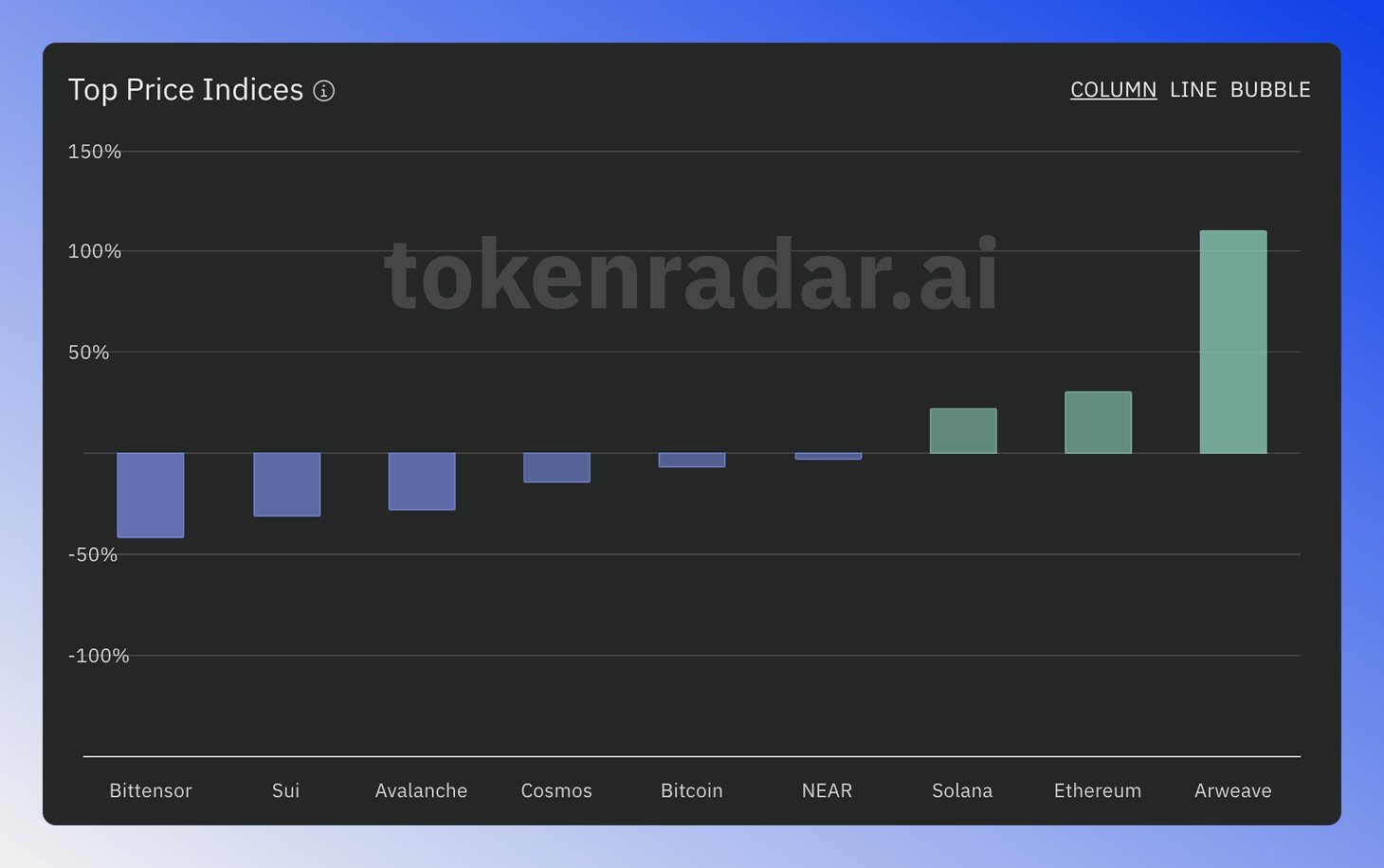
The Column Chart ranks all blockchains based on how well they performed.
Each column's height represents the percentage increase in either market cap or price, depending on which algorithm option you choose.
This increase is shown for the time period you select.
Indices Table
The table below the chart provides a numerical overview of the performance of all blockchains.
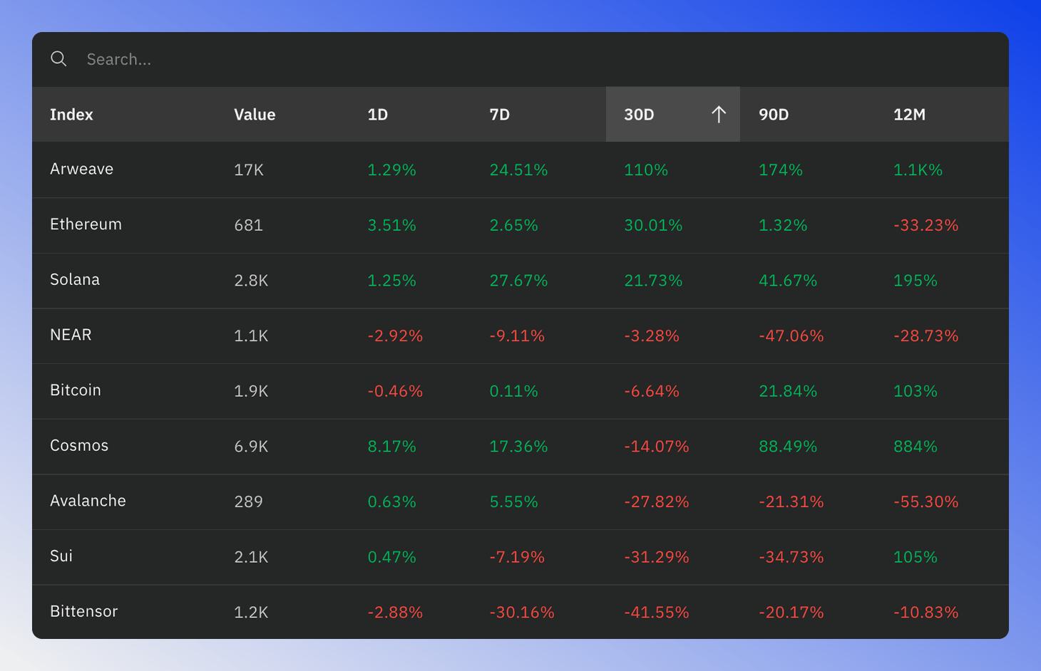
Value: For the algorithm Marketcap - Standard Weight, this is the total of all market caps of the tokens in the index. The value is then either shown in USD or relative to the marketcap of the selected currency. For other algorithms the index value is not very useful by itself.
1D/7D/ETC: Marketcap or price change, relative to the selected base currency, during this time period.
Market Leadership Chart
The Market Leadership chart compares an equal-weighted and a cap-weighted (marketcap-weighted) version of the market index. An equal-weighted index gives more importance to smaller, lesser-known tokens compared to the cap-weighted one.
In a bull market, smaller tokens tend to outperform larger ones, so the equal-weighted index should trade above the cap-weighted one. The chart turns green when this is the case, and the line above the chart says which version is leading and by how much.
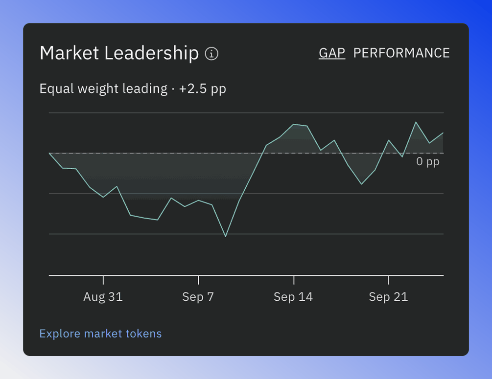
The Market Leadership chart has two modes:
- GAP: Shows the difference between the equal-weighted and the cap-weighted index in percentage points.
- PERFORMANCE: Shows both versions, starting at 100 on the first day of the selected time range.
In GAP mode, an upward-sloping line suggests a possible bullish trend reversal, while a downward-sloping line indicates a potential bearish reversal. The Explore market tokens link opens the screener.
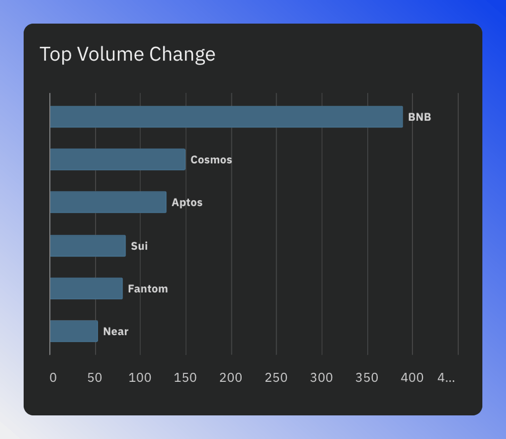
Top Volume Change
The Top Volume Chart shows blockchains with the largest trading volume increases.
Higher volume often hints at potential future price growth. Watching these blockchains closely can be helpful for spotting market trends.
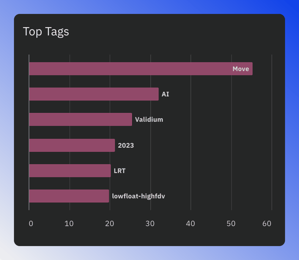
Top Tags
The Top Tags charts display the highest-performing tags during the chosen time frame and on this blockchain.